Cognitive Accessibility Design Pattern: Use a Clear and Understandable Page Structure
User Need
I need to easily understand, navigate, and browse both the site and page structure.
What to Do
Carefully design the layout of the page. Make sure it has a clear structure and hierarchy so that it is easy to understand.
This can be achieved by:
- organizing the page content into logical sections,
- clearly differentiating regions using dividing lines, whitespace, and background colors,
- providing headings and other visual cues to indicate the structure and purpose of the regions,
- making any relationship between regions of the page clear, and
-
using visual indicators to help people understand:
- structure and relative importance of the page content,
- the grouping and association of items, and
- when items have a different purpose to surrounding information.
How it Helps
People with cognitive and learning disabilities may not be able to use content and applications when the page structure and relationships are unclear. The user may not complete tasks and miss key information. The user may not return to pages that are complicated to use and understand.
Clear, well organized page layouts enable users to easily find key information. They can focus on their tasks instead of working out what is on the page. Using a standard visual layout, and positioning elements consistently, will help users rely on muscle memory and use them. This supports people with disabilities that impact their problem solving skills, slow readers, or people who get overwhelmed when presented with a lot of text. This includes:
A good structure: Organization of page content into sections, each with an obvious purpose, allows users to more easily locate and focus on the sections they need. Content that is not directly relevant to the main purpose of a page should be distinctly separated.
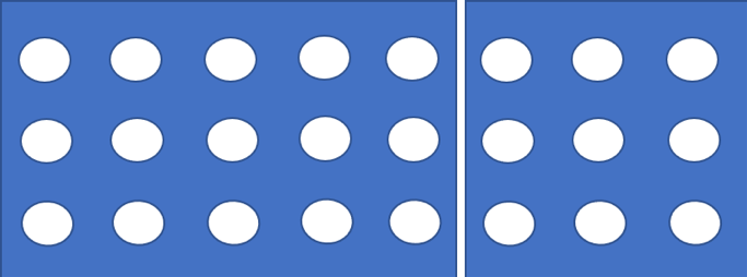
Use borders and shading to group: Grouping information using a border or color shading makes it easier for people to identify groups.
For example:


Figure: Example of grouping with shading and borders.
Visual cues: People who have difficulty recognizing or comprehending written language or concentrating, can find graphical cues easier to process. Examples of common graphical indicators and visual cues include:
- grouping summaries of content,
- using a card design using colors or white space,
- flagging important information, such as using call out boxes, and
- indicating different types of information, such as placing quotes in speech bubbles.
More Details
If pages have a lot of content, check that content is grouped and you can see what is related.
Making regions and a clear page structure can include:
- Clearly label content categories, and use familiar visual cues and icons. This will help recognition and retrieval rather than rely on memory. The background color can be a clear divider if the contrast is strong enough.
- The heading structure should create an outline of the document that could serve as an abstract of the whole document.
Icons should be used consistently. It is also important the graphical indicators do not clutter the interface. Too many icons can add to the cognitive load for users to process. Examples of clear dividers include high contrast borders or white space. A change in background color can be a clear divider if the contrast is strong enough.
Examples
Use:
- Well separated sections of content. White space, borders, or call outs are used to separate sections.
- Headings and icons to help define sections of content. This organizes the information on the page so it is easier to understand the layout and find specific information.
- Call outs boxes.
Avoid:
- Dense text, with little white space.
- Unclear page structure and hierarchy.
- Lack of visually differentiated sections.
- Sections without headings or icons that define sections. For example: A web page has chunks of content run into each other with a “flat design”. Many users with cognitive disabilities will find it challenging or impossible to work out which chunks belong together. Thus, all the benefits of chunking content are lost.
- Groups and page sections that are not logical.
User Stories and Personas
User Story
Personas
- Alison : An Aging User with Mild Cognitive Impairment
- Amy : An Autistic Computer Scientist
- Gopal : A Retired Lawyer with Dementia
- Kwame : A Traumatic Brain Injury Survivor
- Maria : A User who has Memory Loss
- Sam : A Librarian who has a Hemiplegia and Aphasia
